A Beginner's Guide to Choosing the Right Font for Your Tattoo
A tattoo is more than just ink on skin; it is a permanent mark of a moment, a memory, a belief, or a passion. It’s a story you choose to wear for a lifetime. When that story is told through words—a meaningful quote, a cherished name, a significant date—the choice of font becomes as crucial as the words themselves. The font is the tone of voice for your message. It determines whether your statement whispers with elegance, shouts with boldness, or flows with personal, handwritten grace.
Choosing the right font for your tattoo can feel like an incredibly high-stakes design decision, and in many ways, it is. The wrong choice can undermine a powerful sentiment, create a piece that is difficult to read, or, worst of all, age into an unrecognizable blur. A great tattoo font complements the meaning of the words and is technically sound enough to look good for decades to come.
This guide is designed for beginners navigating this exciting but daunting process. We will explore the world of tattoo lettering, from classic styles to modern trends. We'll delve into the critical factors you must consider—like placement, size, and how fonts age on skin—and discuss how to work collaboratively with your tattoo artist to ensure the final result is something you will love forever.
The Psychology of Typography: Why Your Font Choice Matters
Before you start scrolling through endless font websites, it's important to understand that fonts have personalities. They are a form of visual communication that evokes emotion and sets a specific tone, independent of the words they form. This is the psychology of typography, and it's at the heart of choosing a great tattoo font.
Think about how different styles make you feel:
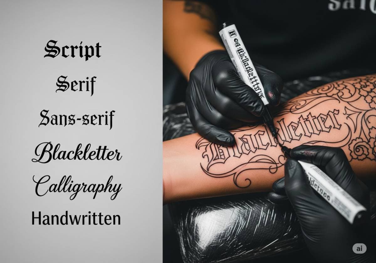
- Serif Fonts: With their small "feet" at the ends of the strokes (like Times New Roman), these fonts often feel traditional, classic, intelligent, and literary. They carry a weight of history and formality.
- Sans-Serif Fonts: Lacking the small feet (like Helvetica or Arial), these fonts feel modern, clean, minimalist, and direct. They are straightforward and highly readable.
- Script Fonts: These fonts mimic handwriting, from elegant, flowing calligraphy to a casual, personal scrawl. They feel intimate, romantic, and human.
- Gothic & Blackletter Fonts: With their dramatic, angular, and heavy forms, these fonts feel historic, powerful, traditional, and sometimes rebellious or aggressive.
The goal is to create harmony between the meaning of your words and the feeling of the font. A quote about minimalism and simplicity would feel right at home in a clean sans-serif font, while a romantic line of poetry might be best expressed in a flowing script. A mismatch in tone can create a confusing or dissonant message.
A Tour of Popular Tattoo Font Styles
While there are hundreds of thousands of fonts, most tattoo lettering falls into several key categories. Understanding these styles will help you narrow down your search and communicate your ideas to your artist.
Classic Serif Fonts
Serif fonts are the stalwarts of the printed word, and they bring a sense of timeless elegance to skin. Their small decorative strokes add a touch of formality and grace.
- Best for: Meaningful quotes from literature, memorial names and dates, single words that convey wisdom or tradition (e.g., "Patience," "Selah").
- Things to Consider: For smaller tattoos, the tiny serifs can be the first things to blur or fade over time. A skilled artist will know how to simplify or slightly enlarge them to ensure longevity.
Modern Sans-Serif Fonts
Clean, crisp, and direct, sans-serif fonts are a popular choice for modern, minimalist tattoos. Their simplicity makes them incredibly versatile and highly readable.
- Best for: Single, impactful words (e.g., "Breathe," "Enough"), coordinates, minimalist phrases, acronyms, or any text where clarity and a modern feel are paramount.
- Things to Consider: While highly legible, some very generic sans-serif fonts can feel a bit "corporate" or impersonal. Look for variations with unique character or subtle styling.
Elegant Script & Cursive Fonts
Script fonts are designed to look like handwriting, making them one of the most personal and popular choices for tattoos. They range from formal, ornate calligraphy to loose, casual handwriting.
- Best for: Names of loved ones, romantic words or phrases, personal mantras, or a design that mimics a real signature.
- Things to Consider: This style comes with a major warning: legibility. Many beautiful script fonts are difficult to read, especially when small. Furthermore, very thin lines and tight loops are extremely susceptible to blurring as the skin ages. A great artist is needed to ensure proper spacing and line thickness.
Bold Gothic & Blackletter Fonts
Associated with medieval manuscripts and a heavy, dramatic aesthetic, blackletter fonts make a powerful statement. They are angular, high-contrast, and demand attention.
- Best for: Single powerful words, initials, last names, or text that needs a historic, metal, or hardcore vibe.
- Things to Consider: Readability is very low for phrases or sentences. This style is best for short, impactful text. It requires an artist with very clean and steady line work to execute properly.
Unique Typewriter Fonts
This style has a nostalgic, slightly grungy, and mechanical feel. It evokes a sense of literature, journalism, and raw, unfiltered thoughts.
- Best for: Quotes, literary references, dates, or words that feel like a personal note-to-self.
- Things to Consider: The signature "imperfection" of a typewriter font (like slightly misaligned letters or faded ink spots) needs to be tattooed intentionally and skillfully. In the hands of an inexperienced artist, it can end up just looking like a poorly done tattoo.
Minimalist & Fine-Line Fonts
A very popular modern trend, fine-line or single-needle fonts are extremely thin and delicate. They create a subtle, almost pencil-like effect on the skin.
- Best for: Small, discreet words or phrases, often placed in delicate areas like the wrist, ankle, or behind the ear.
- Things to Consider: This is the style most at risk of aging poorly. Fine-line tattoos are notorious for fading significantly or blurring out completely over time. They absolutely require a specialist artist and will likely need more frequent touch-ups over the years to remain crisp.
Crucial Factors to Consider Before Choosing Your Tattoo Font
Beyond the style, there are practical, physical realities you must consider to ensure your tattoo is a success.
Size and Placement on the Body
This is the golden rule of tattoo lettering: the smaller the tattoo, the simpler the font must be. An incredibly detailed script font might look amazing blown up on a computer screen, but it will become an unreadable black smudge when shrunk down to fit on your finger. You must also consider how the font will interact with the contours of your body. A rigid, blocky font might look awkward wrapped around a curved area like the forearm or ribs, whereas a more fluid script might complement it perfectly.
The Test of Time: How Tattoo Fonts Age
Skin is a living, changing canvas, not a piece of paper. Over the years, skin cells regenerate, and ink particles naturally spread out slightly. This process is called "ink migration." It means lines get thicker and the space between lines gets smaller.
- The Key to Longevity: Choose fonts with ample "negative space." This means good spacing between the letters and enough open space within the letters themselves (like the loops in 'e' or 'a').
- What to Avoid: Fonts with very thin lines, tiny intricate details, or letters that are squished together are a recipe for a blurry tattoo in 5-10 years.
Legibility and Readability
This is a personal but important question to ask yourself: Do you want other people to be able to easily read your tattoo, or is its meaning primarily for you? An abstract, ornate script might be a perfect choice for a personal mantra meant only for your eyes. However, if the tattoo is a memorial to a loved one, you likely want their name to be clear and legible to anyone who sees it.
The Collaborative Process: Working with Your Tattoo Artist
Do not think of yourself as just a client; you are a collaborator. Your tattoo artist is a skilled craftsperson whose expertise is vital to the success of your lettering tattoo.
Don't Just Bring a Font File
While it's great to do your research, don't just download a .ttf font file and expect the artist to use it like a rubber stamp. Many fonts designed for digital use are not suitable for tattooing. A good artist will often use your chosen font as a starting point and then redraw it by hand, simplifying details, thickening lines, and adding proper spacing to ensure it will look good and last on skin.
Use Font Generators for Inspiration, Not as a Final Blueprint
Websites like DaFont, Font Squirrel, or even a simple tattoo font generator are fantastic tools for inspiration. Browse these sites, find several fonts you like, and bring them to your consultation. Be prepared to explain to your artist what you like about each one. Is it the boldness? The curve of a specific letter? This gives them the creative direction they need to design a custom piece for you.
Trust Your Artist's Expertise on Aging and Placement
This is the most critical piece of advice. If your artist, with their years of experience, tells you that the font you've chosen is too small for the chosen location, or that the lines are too thin to age well, listen to them. They are not trying to crush your vision; they are trying to save you from a future of regret. Their goal is to give you a tattoo that you will be proud to wear for the rest of your life.
Conclusion: A Lifelong Statement
Choosing the right font for your tattoo is a journey that balances personal meaning with the practical realities of ink and skin. The font you choose is the body language for your words, giving them emotion, power, and personality.
Your perfect tattoo will be born from a thoughtful process. Consider the emotion you want to convey, explore different font styles for inspiration, and think critically about how size, placement, and time will affect the final piece. Most importantly, enter into a partnership with a skilled tattoo artist. By combining your personal vision with their technical expertise, you can create a piece of lettering art that is beautiful, legible, and a meaningful statement you will cherish for a lifetime.
Comments (0)
Leave a Comment
Your feedback and thoughts are welcome.
Be the first to comment!